If you are new to this dev blog, and want to catch up, check out the previous episodes:
Development Update
Can you hear the roaring sound of the alpha? No? Well, that’s because there is no sound in the game yet. However, gameplay-wise we are getting there!
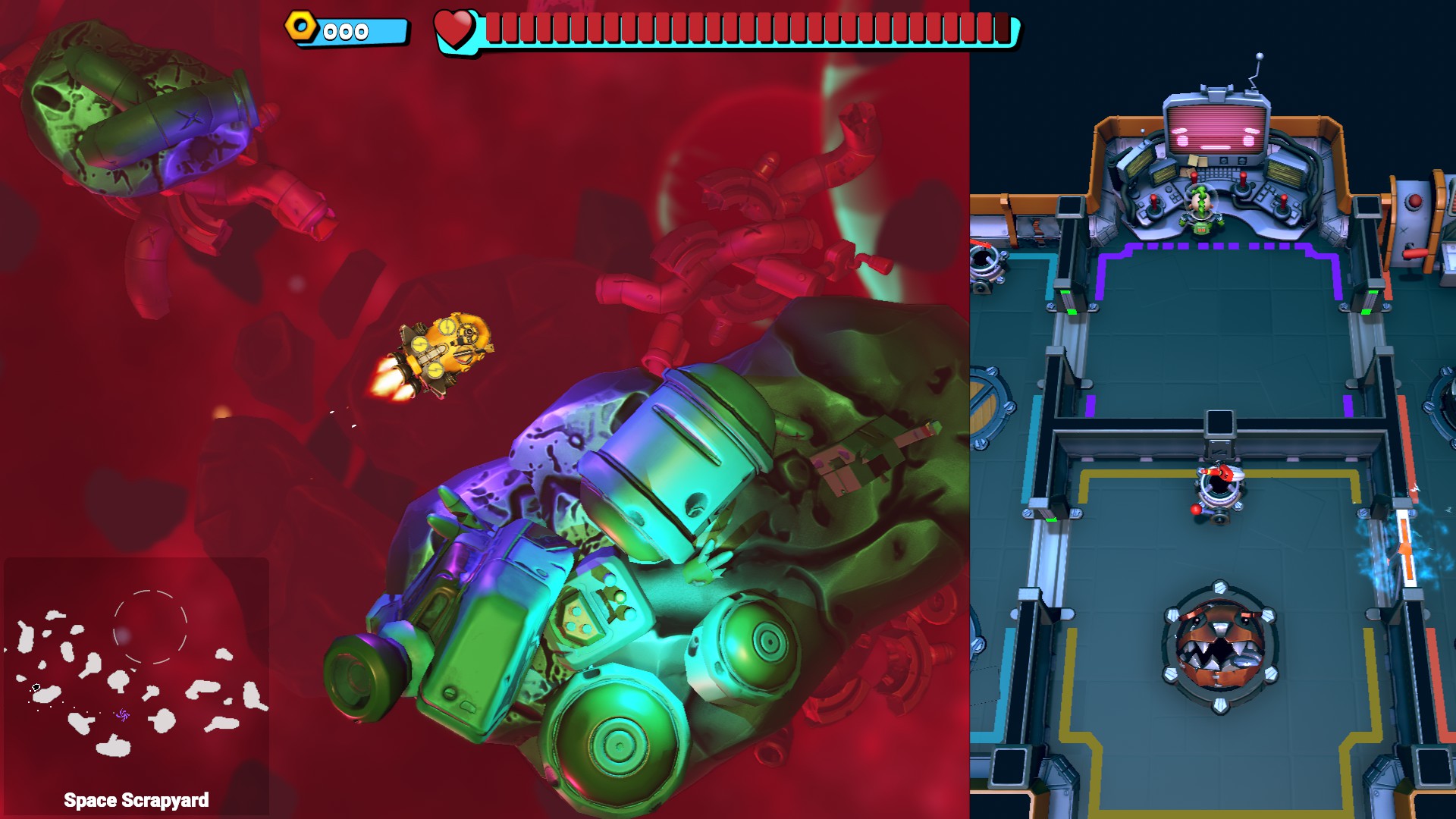
We Are Screwed! features a unique split-screen view that shows you both the inside of your spaceship as well as what’s going on outside the ship. For a long time we had a rather polished inside scene right next to a more or less blocked out version of the outside/surroundings. In the last couple of days, things finally started to come together, check out this sneak peek:
We tried surviving the hottest days of the year (so far), and we partially succeeded. Could you all comment “I’m ok” so that I know for sure? We don’t have AC in the office, but luckily, a big metal fan was there to help out – as can be seen in last week’s stream recording:
As with every blog post, I wanted to choose a topic that we had to deal with during the sprint. First, I wasn’t sure what to pick, but at one of our super rare meetings at the coffee machine, Felix strongly confirmed that we must talk about…
User Interface Madness
In the last two blog posts I wrote a lot about planning and time estimations. Let’s now come to the most underestimated type of them all: User interfaces. When you start planning a project, you typically have a ballpark figure in mind when estimating all the tasks. In almost all our projects, user interface is typically the thing that does not get enough time in schedules.
So I asked a few people on the team what they thought about estimating user interface creation…
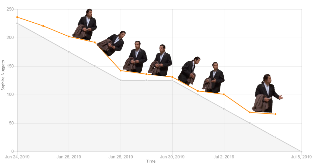
Estimating the creation of user interfaces is the root of all evil.
Everyone on the team
But why is that? Let’s take a look at it step by step. Before starting the actual work on the UI, there is the situation were you have to block out a certain amount of time in your schedule. “Alright, let’s just assume 20 hours for this, it’s just this simple menu”, is something to be heard at that time. The dilemma is right there: You have no idea how the UI is going to look like, how the user interaction works in detail – hell, you don’t even have a mockup.
So someone on the team will start working on a mockup for it, eating up time from the original estimation. Most of the times, it needs a second iteration for getting this right. Next, maybe someone else starts implementing that mockup, and there comes the next issue: Mockups are never complete. They are always lacking something. Maybe there is this additional panel when you click on this button on the second subpanel of the third tab, or you realize that mockups are often just static images that do not show any animations, effects, fading, or timing.
Then, when you have the first version working in the game, you realize that it needs another iteration because it does not work as smoothly as expected, or some things are not clear to the player – and so you put yet more time into it. How much is now left of those 20 hours?
And so the new UI makes it into the actual game and is being tested for the first time. There is more feedback and more little details where improvements can be done.
It just takes so many iterations to get everything right.
It can help a lot to look at other games, and how they solved similar menus, HUDs, widgets, or UI panels. Sometimes you don’t have to reinvent the wheel. Also, make sure to playtest with fresh players who have not seen any of the previous iterations, otherwise they might be biased or used to what they were experiencing before.
Here is a magic rule of thumb for estimating UI tasks. First, think of all the steps and number of iterations it is probably going to take. Be aware of the fact that mockups are never complete, usability needs to be discussed once you created those mockups. Break down UI work into granular tasks, don’t assume any hours before thinking about specifics and details. Ask yourself about the level of quality and polish you are aiming for. Think about the workflow and the people needed to actually create it – sometimes it’s not just one person, but a lot of people involved as you have to deal with mockup creation, implementation, animations, and effects.
Then, together with the team, do a conservative estimation of the work to be done, and correct it as follows:
- Optimistic developer? Double the estimate.
- Experienced developer? Still double the estimate.
We would love to hear your thoughts, and discuss your experiences with creating or dealing with user interfaces – feel free to reach out, write a comment here, or hang out with us on our Discord.
And now, for the fun of it, here is a comparison of how the options screen evolved in We Are Screwed!
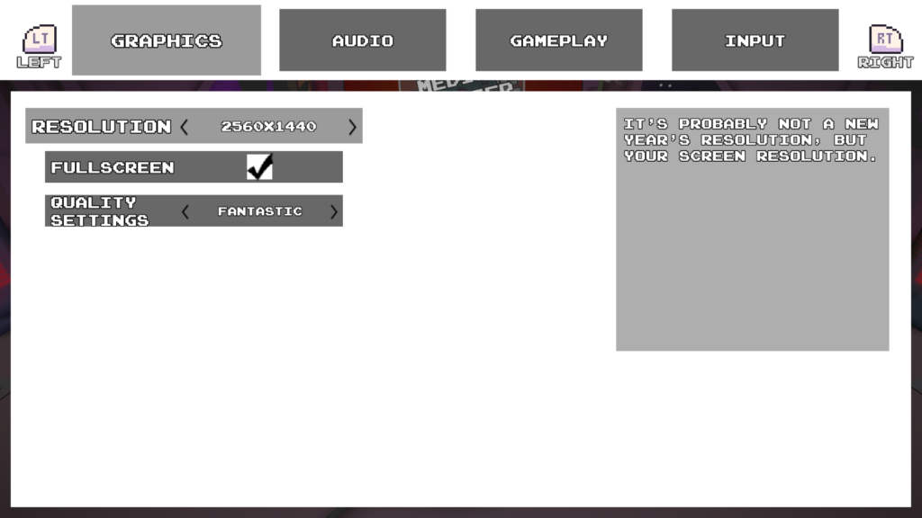
We Are Screwed! – Options Menu Prototype 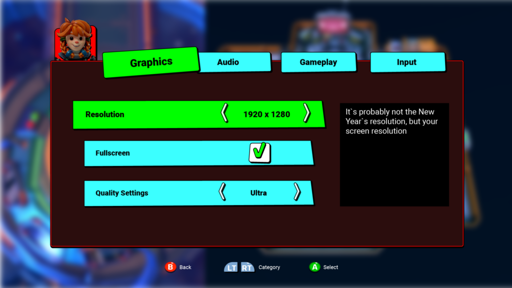
We Are Screwed! – Options Menu Mockup 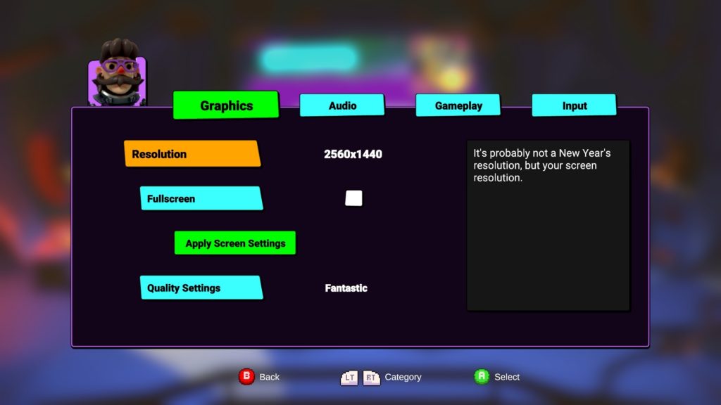
We Are Screwed! – Options Menu in Game
Oh wait, why is the “Apply Screen Settings” button highlighted in green here?! Oh no, we need another iteration – this needs to be fixed!
To be continued…
In the meantime, please feel free to reach out via:
It took us 39870 coffees to get this far.